
Join the InfoLit Learning Community now. Already a member? Log in here.
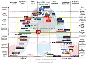
On April 26, Credo will offer a free webinar in which Vanessa Otero will discuss her viral Media Bias Chart. The chart is a tool that ranks news sources on two axes: from “Contains Inaccurate/Fabricated Info” to “Original Fact Reporting” and from “Most Extreme Liberal” to “Most Extreme Conservative.”
Otero tells Credo she developed the chart for use with her friends. We think that says a lot about her passion for information literacy, and it seems librarians agree—Otero tells us that she’s heard interest from many of you since starting this work. For more from the patent attorney-turned-media-bias-expert, please see our recent interview with her in which she discusses how she got involved in this work, how she decides where in the chart a source falls, and how librarians should best serve patrons who favor sources the librarian believes to be misleading. Ahead of the webinar next week, take a look at the current version of the chart and at Vanessa’s blog, All Generalizations Are False.
The blog offers a valuable look at Otero’s media awareness and habits as well as decisions regarding the chart that she has made over time. Her criteria for evaluating items—whether a source exists on TV, for example, and if so, whether it existed before cable—is a mini-class in media literacy and will be invaluable to librarians who need a checklist for their IL classes. Otero’s acknowledgement of her own bias and her reasoning about why infrequent readers can be overly trusting is written in a direct and understated way that offers an ideal model for students writing something contentious. Lastly, the author’s notes on why she has made revisions in her thinking and work are instructive, too. Students can benefit from seeing how an expert’s thinking is always evolving, in some cases because of feedback from others (remember the ACRL disposition stating that scholarship is an ongoing conversation?).
The chart that is available now is version 3.1, and you can read about the changes since the last version here—one is a halt to the use of the term mainstream, as Otero says that “that term is so loaded as to be useless to some audiences.” Otero notes that she evaluates sources based on measuring their individual stories. However, the blog post relating to version 3.1 also notes tells “news nerds” that she has also begun analyzing stories on a sentence-by-sentence basis.
We’re really looking forward to hearing more from Vanessa Otero on her motivations, decisions, and experiences regarding the Media Bias Chart. Please join us on April 26 and have your questions ready to share!